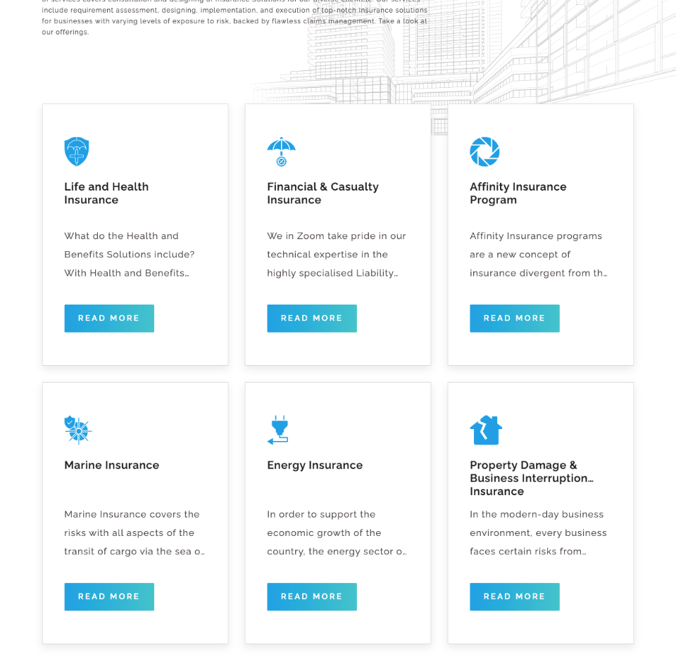
A multi-disciplinary, composite insurance broking entity whose focus is to provide sustainable insurance solutions backed by robust service and support to the corporate community; enterprises, insurers, and re-insurers across the globe.

Problem statement
A 10-year-old insurance aggregator looking out to build a contemporary brand image. Seeking a brand personality to reflect the core values of knowledge, transparency while cueing their category benefit of protection.

Our approach
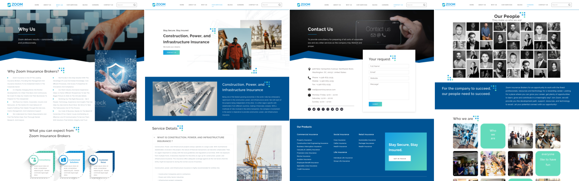
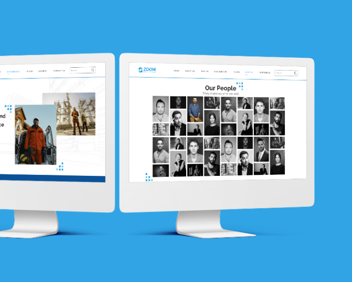
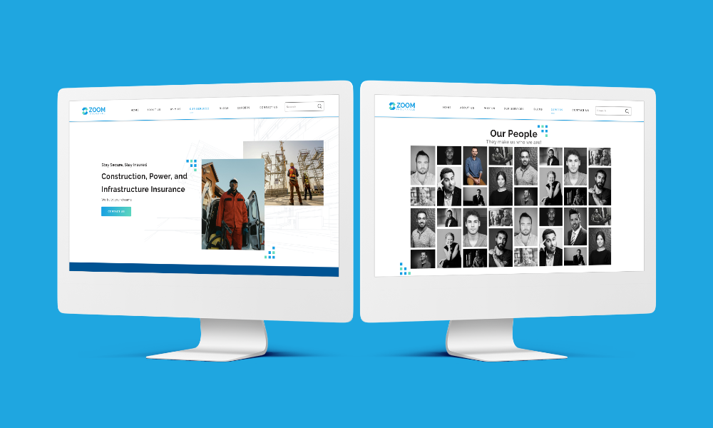
We decided to provide a braiding and strategy solution that would align with the client’s focus and requirement. Taking a brief of the existing client portfolio, Ikokas suggested building a brand new image starting from their website built from scratch which is visually appealing and other essential factors as follows:

Logo
The logo is the first impression of any brand. This is what defines a brand and we focused closely on developing an underlying system of colours, shapes, and the message. The colours, blue and green were selected because blue signifies integrity, trust and green signify money, harmony. The shape of the logo is derived from the client’s brief of ‘Protection’. The arcs on top and bottom conveyed that “you are protected and insured by the company”.

Marketing collaterals
To help the company quickly communicate the key benefits of the business and product to prospective customers in visually compelling manner, our team of experts started researching on the right collaterals. The object was to identify and create a collection that can be used to inform, guide and educate both prospects and customers.

Website design
User Experience (UX) and User Interaction (UI) means that a designer looking at a website from a user’s perspective and tailoring the website as per the user’s needs considering the Industry and audience behaviour on the similar websites based on the latest trends. The previous website was not user friendly; it was not evoking the right emotions, the website UX/UI needed improvement on various aspects. The previous site provided the user with a poor and confusing routing over website, overcrowded information and repetitive content with little or no structure and discipline. In such cases, the consumer is sure to get lost in a sea of information presented. The new website is designed keeping the consumer’s journey and time in mind.

Visually appealing with better navigation and it allowed the user to understand the whole gamut of services that the company offers without putting a cognitive load on the user. The website has a structure and flows to highlight the journey and achievements with a better feedback mechanism to engage customers. The site could also benefit from adding details as awards won, visitor’s statistics etc. Keeping the business in mind and customer’s short span of attention on the website the field for the customer to provide necessary information to reach the company directly faster and with lesser hassle. In terms of content and structural representation, inputs were considered from exceptionally skilled people of the industry.

Explore Other Case Studies